

The Franklin Post, along with most professional newspapers, is printed in the typeface Times New Roman (TNR). TNR was developed by Stanley Morison — a British typographer — and first appeared in London’s “The Times” in 1932. Designed to accommodate as many letters as possible per line of text while maintaining legibility, the typeface was ideal for newspapers and pamphlets. Because TNR often appears within informational texts, most people associate it with trustworthiness and sophistication.
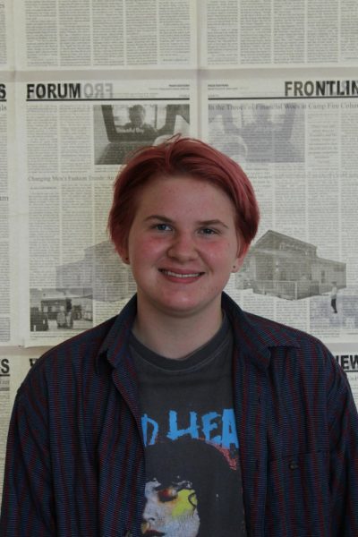
However, despite its original goal of clarity, TNR can be especially difficult to read for those with vision problems or word processing disorders. Fonts with serifs — decorative lines attached to the edges of letters — can distort the shape of the characters, making them less clear to many people with dyslexia. “When [I’m] reading things, it takes me a long time to fully process the letters [because] it feels like they all melt together,” explains Franklin sophomore Aspen Howser-Daunt, who has dyslexia. They find TNR particularly challenging to read, because “there just isn’t enough variation between letters.”
To combat this issue when reading online, Howser-Daunt installed a browser extension that puts all text on their computer into Dyslexie Font, a typeface specifically designed for readers with dyslexia. “This font is easier to read because all the letters are thicker on the bottom and lighter on the top,” they explain.
Jared Smith is the executive director of Web Accessibility In Mind, a non-profit service center at Utah State University. The center helps organizations make their online content more accessible by providing training, evaluations, and consultations. “Dyslexia is a rather broad term that encompasses several different types of reading or phonological disorders,” he explains. This distinction means that individual type design needs vary. Some people with word processing disorders, like Howser-Daunt, prefer reading in specifically-designed accessibility fonts, but others may find them just as frustrating.
Although reducing unnecessary serifs in type can make individual letters easier to process, specific fonts designed for dyslexic individuals may not always be the best solution. One 2017 study found that elementary students with dyslexia showed no noticeable improvement in reading speed or comprehension of text written in OpenDyslexic, another popular dyslexia font, compared to text in Arial or TNR.
The typeface of a document can have a large impact on reader experience, even for those without dyslexia or vision problems. Many fiction or fantasy books utilize unique typefaces to set the mood of a scene. Swirly serifs and faux-handwriting can build atmosphere and create a more authentic reading experience, but some readers find this distracting, as it can decrease legibility. Franklin junior Alex Fouts feels that “authors often rely on [elaborate fonts] instead of actual writing.” Fouts feels that this can detract from the storytelling of a piece.
Smaller changes to a text can also impact a reader’s experience. As Lead Product Designer for the New York Times (NYT), Matt Argomaniz is in charge of adjusting the text on all NYT websites and apps. “All typography [in online pieces] should resize based on a user’s preferred font size,” explains Argomaniz. This way, readers can adjust the type size in accordance with their own needs, and designers can accommodate multiple users at the same time. “I think seemingly imperceptible differences can change the atmosphere [of a design],” he says. One of these differences is the color of the text. Argomaniz emphasizes the importance of contrast between text and background color. As anyone who has ever sat through a slideshow presentation featuring yellow text knows, light colors against light backgrounds are often difficult to read. However, there are a few times when less contrast can actually be beneficial. “Long form story text on an NYT article is ever so slightly dimmer than the default text color,” explains Argomaniz. This is because slightly dimmer text can reduce strain on eyes when reading for an extended period of time.
There are many factors to consider when choosing a typeface for a document. “[I] generally use Arial or Times New Roman [for school assignments], as those fonts are often encouraged by teachers,” says Fouts. However, he also likes Courier New — a spaced-out serif font in the style of an old typewriter — because it “has a little more personality.”
Lizy Gershenzon is the creative director and co-founder of Vectro Type Foundry and Future Fonts. The companies are community forums that design and sell fonts. Gershenzon’s background as an editor and designer affords her unique insight into the subtleties of fonts and the practical concerns of their application. “First, I consider the font’s look, feel, and quality,” she explains. “I also consider who designed it, who I am supporting and promoting when I buy that font, and whether that designer’s perspective and background align with the project.”
When it comes to selecting a font for a document, there are many factors to take into account, and personal font choices are often a reflection of a user’s background. Those in the font design industry, like Gershenzon, may consider a font’s designer and its intended purpose, whereas students like Howser-Daunt and Fouts are more likely to consider input from teachers and what they personally prefer to read. Accessibility must also be considered. Altering the contrast, size, and typeface of a text are all good ways to ensure a piece is accessible to anyone who might want to read it.