


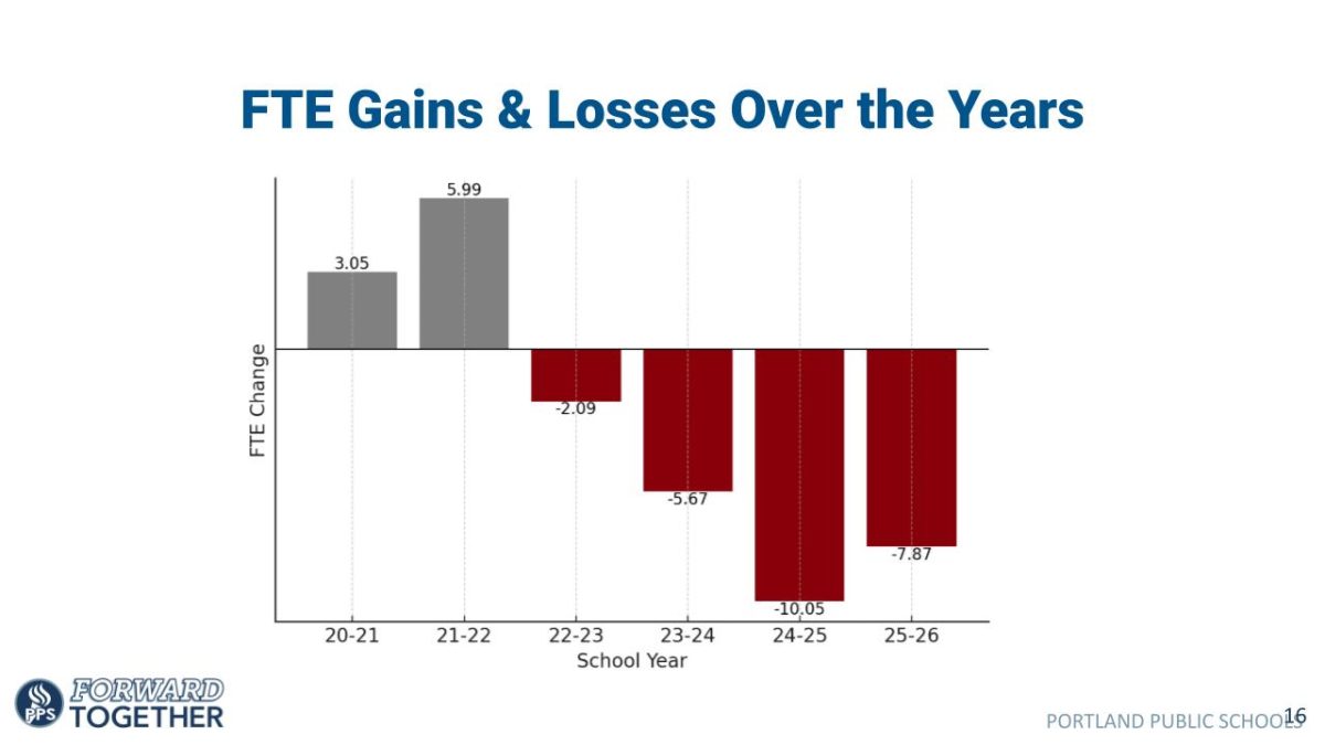


While flags might not seem especially important today, they have always been and still are a big part of history in the places they represent. For example, the American flag’s history is often taught in schools. To the average person, this history and design of such a flag might not seem very important, but others dedicate their lives to the study of flag design and history, called vexillology. There are many vexillology associations scattered around the United States, but the two largest associations are the North American Vexillological Association (NAVA), and our very own Portland Flag Association.
In a 2015 TED talk titled “Why city flags may be the worst thing you never noticed,” Roman Mars explains that many cities and even states slap their seal onto some fabric and call it a flag. While this isn’t always a terrible thing, it makes for a lot of similar looking flags. Oregon’s flag is no exception. It consists of two colors, blue and gold, the simplicity of which doesn’t make up for the complexity of this double sided flag. On one side is the state crest with the words “State of Oregon” above and the founding date below. On the other side is a detailed illustration of the state animal: the beaver.
The five principles of a good flag are defined by NAVA as:
- Keep It Simple
- Use Meaningful Symbolism
- Use two or three Basic Colors
- No Lettering or Seals
- Be Distinctive or Be Related
The Oregon flag, along with almost all other state flags, violates more than one of these five principles. The Oregon flag is not simple, and contains both lettering and seals. The only thing that the Oregon flag nails down is the use of two basic colors. The Oregon flag also fails to be distinctive, as thirty other states also use the crest on their flag. Because of how common these flags are, vexillologists have adopted the nickname “seal on a bedsheet.” Additionally, more than thirty state flags have text. “If you need to write the name of what you are representing on your flag, your symbolism has failed,” wrote Ted Kaye, the author of NAVAs flag design handbook.
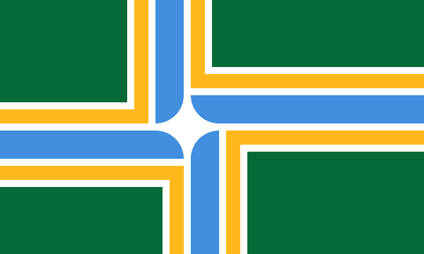
On the other hand, Portland’s flag obeys all guidelines. The flag is made up of a green background and a white four-pointed star from which yellow and blue stripes extend. The current design is largely a result of the Portland Flag Association. Portland’s current flag design is a revision of the flag created in 1969 by Douglas Lynch. In 2002, Lynch gave a presentation at the Portland Flag Association, where he proposed changes and was then assisted by members to create the current Portland flag. The main difference between the two designs is the removal of the Portland seal in the top left corner, which made it follow all five principles.
It is easy to ask, what is the point of city flags if nobody flies them anyways? In his talk, Mars explains that he didn’t even know about city flags until he moved from San Francisco to Chicago, which has a flag that follows design principles. The Chicago flag is seen all over the city, and because of the good design, the flag has become a huge part of Chicago culture. Mars thinks that “people love Chicago more because the flag is so cool.”
In Mars’ closing statement, he mentions the flag of Pocatello, Idaho, which was then rated by NAVA as the worst flag in North America. Mars’ talk, which currently has more than six million views on TED’s website, inspired many flag redesigns, including that of Pocatello. In September 2017, their new flag flew over the city hall for the first time, and Logan McDougall, the Flag Design Community Chair gave his own talk titled, “How Designing a Flag Defined Pocatello.”
Mars’ talk started a worldwide flag redesigning movement as people rushed to create a flag that accurately represented their communities. If you look up any flag that doesn’t follow the five principles, you are bound to find articles about a redesign of that flag. The problem is that it takes a lot of time and effort to change a flag. For example, Oregon’s flag went through a redesign challenge conducted by NAVA in 2009, but they were unfortunately unable to find a legislator to sponsor the new flag.
As shown in Pocatello, Idaho, all that you need to change a flag is enough support from a community. If a place that you are passionate about is home to a bad flag, try designing your own. Mars recommends drawing your flag on a piece of paper one inch tall and one and a half inches wide. This tiny piece of paper is the same as what a regular size flag looks like from 100 feet away, meaning that a design that is easily recognizable on this piece of paper will look good on a flagpole. If you are passionate about it, contact local vexillological associations and newspapers. Maybe your flag will become the new symbol for your community!